
We inspire kids to be their best.
Our History
Highlights started as an American children’s magazine geared towards children ages 6-12 that helps make learning fun through activities like challenging puzzles, engaging stories, mazes, and more.
The story of Highlights began with our founders Garry Cleveland Myers and Carolyn Clark Myers, a retired couple who spent most of their careers as teachers, wanting to share the knowledge they had gained over many years working in education.
While the first issue did not sell as well as expected, the team got creative and came up with the idea to place the magazines in dentist and doctors offices. This idea helped propelled them to becoming a household name. At our peak, we were the most subscribed children’s magazine in the world, with over one billion copies in print.
While the magazine still exists today, our circulation has fallen significantly over the years. We took on the task of rebranding to modernize Highlights and make it more relevant for today.

Our Timeline
Our Logo Evolution
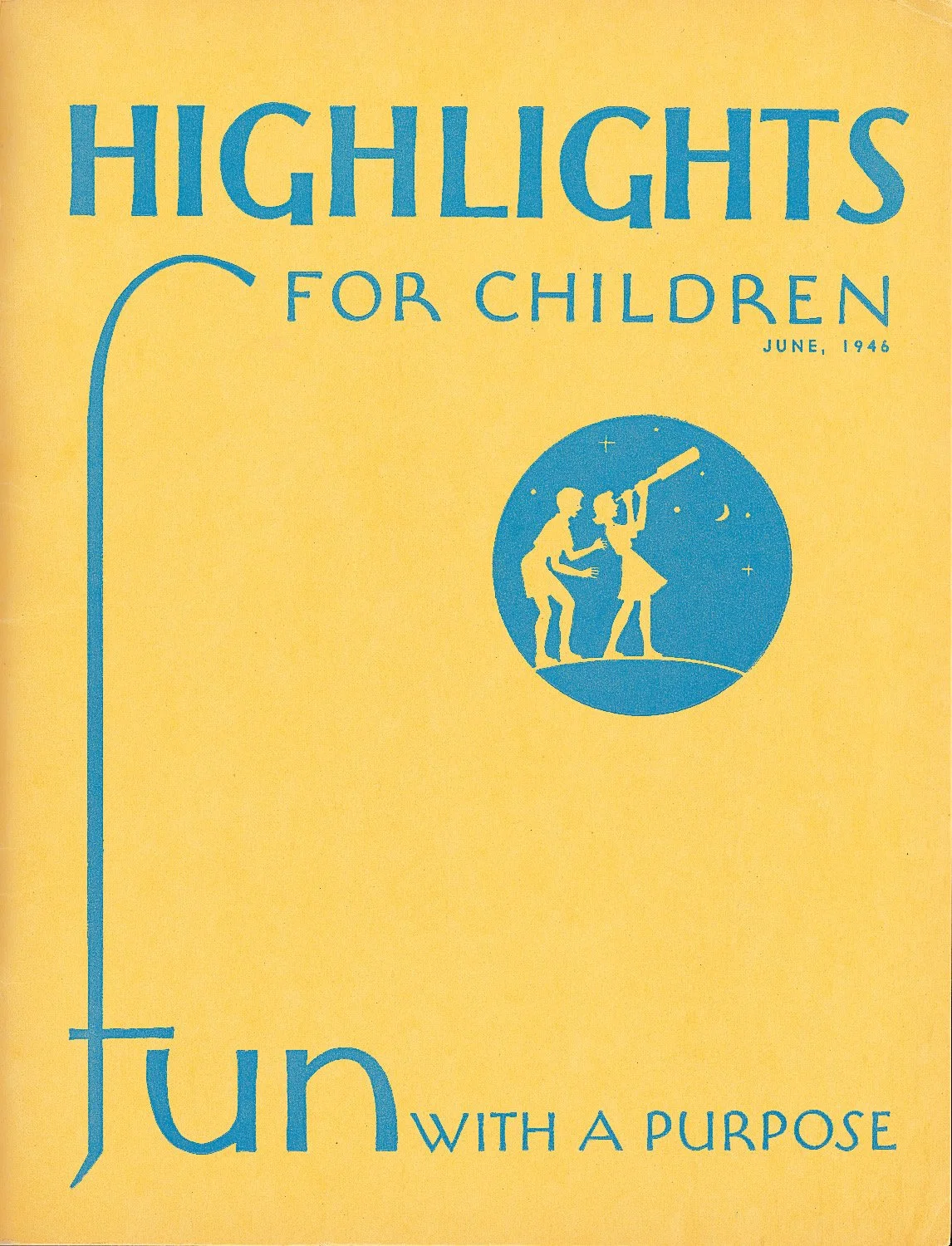

1946
The first logo for Highlights Magazine. The wordmark was created with a humanist sans serif typeface in all caps, and included the words “for children” in the logo.
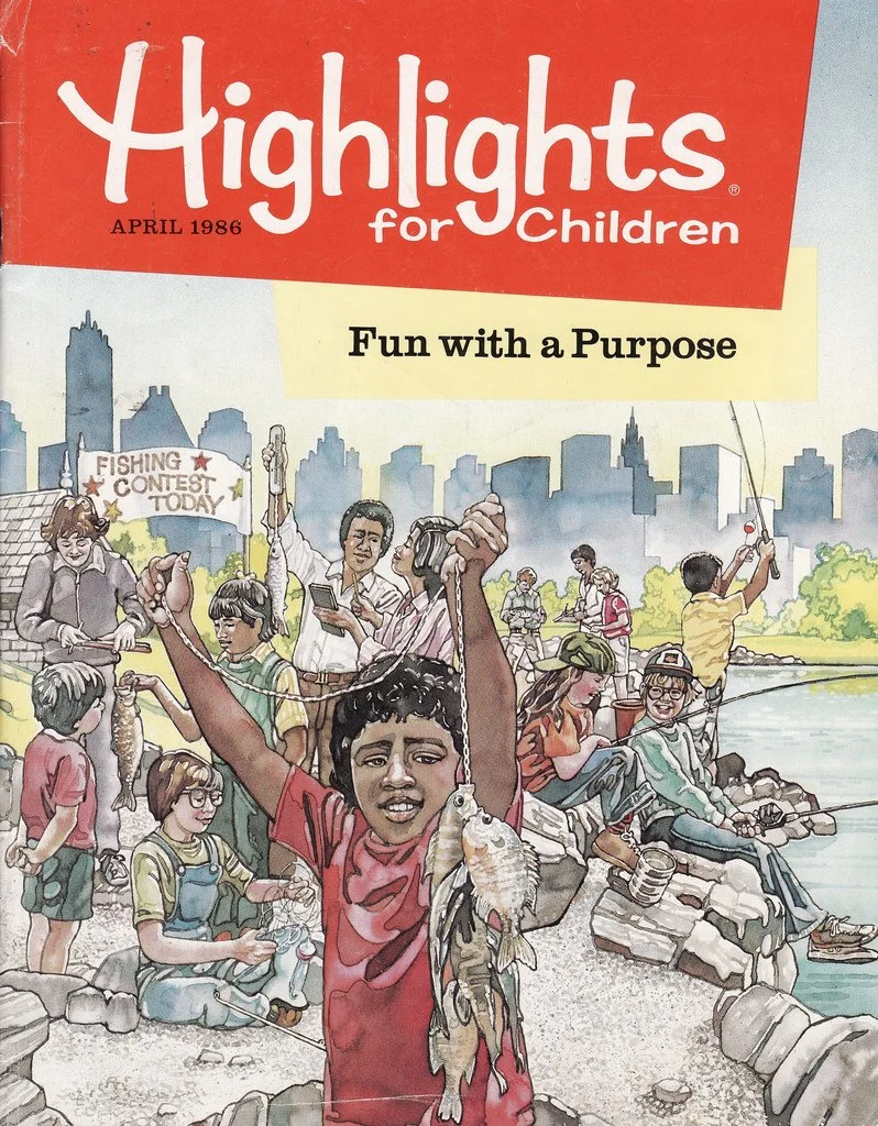
1986
Around this time, the wordmark was changed to a more friendly sans serif using both upper and lower case letters, similar to the logo we’re all familiar with today. The iconic background shape was also introduced during this time.
2001
During this time, the logo was modified to have a more three-dimensional effect using shadows and multiple colors rather than just red and white. The background shape was also slightly modified.
2020
The most recent version of the logo is very similar to the logo that was developed in the 80’s. A flat color background with solid white lettering was used, with the lettering fully inside of the shape.
Our New Logo
Highlights new logo is made up of a symbol and wordmark. Our new symbol portrays Frankie the Firefly, our new mascot! Frankie is a good representation of our brand because of her glowing light. When kids are confident, they light up. When kids learn something new while having fun, they light up. And when kids use their imagination…they light up!
Frankie’s body was designed to be in the shape of a spark to emphasize sparking the imagination. She was placed against the night sky to allow her glow to shine bright. The typeface used as the base of our Wordmark is called Iskra, which means spark or flash, and its design embodies this concept.
